The colors you choose for your home go beyond simple aesthetics; they can have a profound impact on your mood, emotions, and overall well-being. Color psychology, the study of how different colors affect human behavior and feelings, can be a powerful tool when decorating your living space. By selecting the right hues for each room, you can create an environment that not only looks beautiful but also promotes relaxation, productivity, or energy—whatever fits your lifestyle and needs.
In this guide, we’ll explore how you can use color psychology to enhance your home’s aesthetic and influence the mood of each room.
1. Understanding Color Psychology
Color psychology is based on the idea that different colors evoke different emotional responses. Warm colors, like red and orange, can make a space feel more energetic and cozy, while cool colors, like blue and green, tend to promote calmness and relaxation. It’s important to consider the function of the space, the amount of natural light it receives, and the emotions you want to evoke when selecting your colors.
Key Color Associations:
- Warm Colors: Red, orange, yellow—energizing, passionate, and stimulating.
- Cool Colors: Blue, green, purple—calming, tranquil, and soothing.
- Neutral Colors: White, beige, gray—versatile, balanced, and neutral.
2. Using Warm Colors for Energy and Vitality
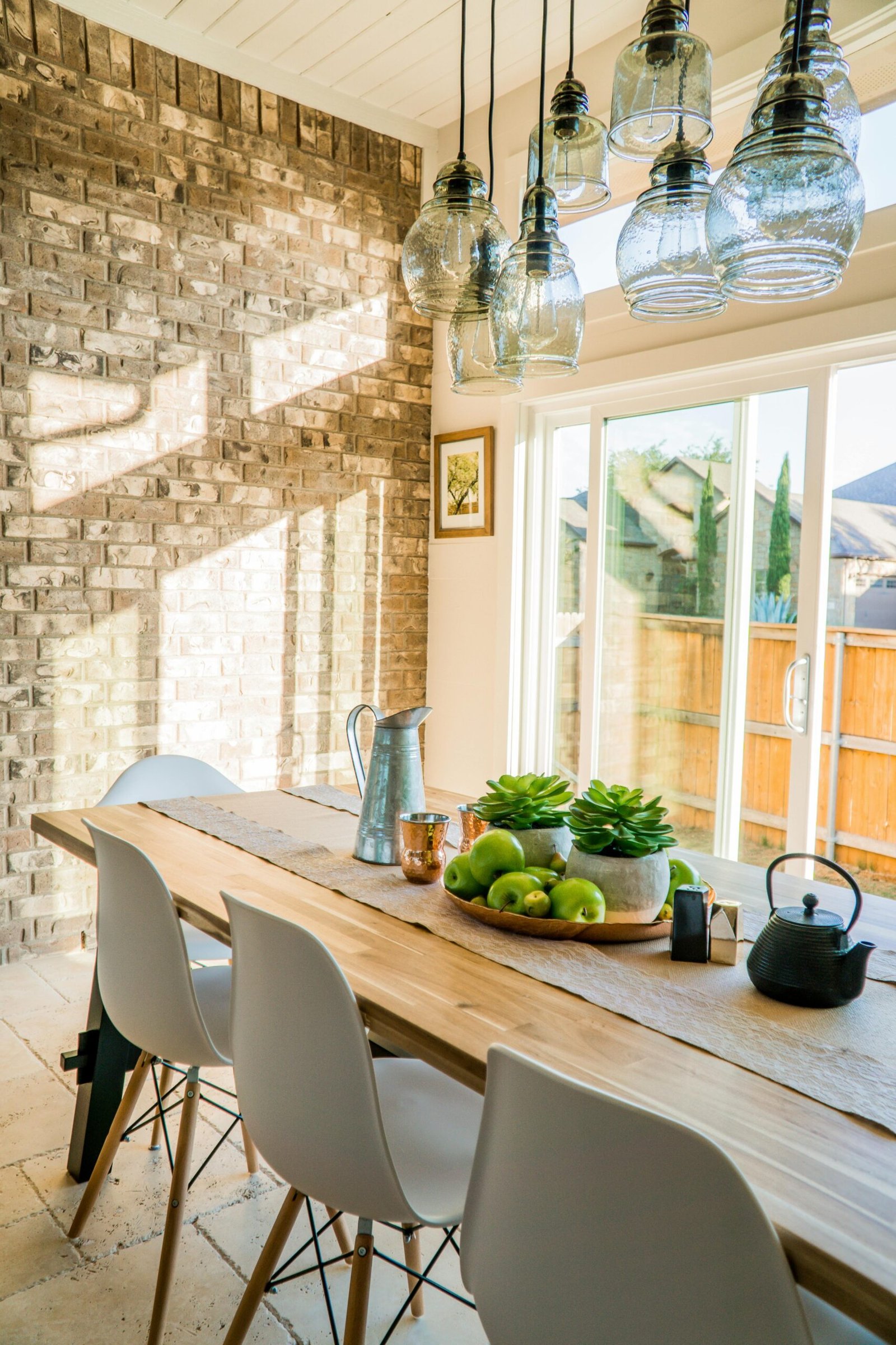
Warm colors like red, orange, and yellow are known for their ability to energize and invigorate a space. These colors are ideal for areas where you want to encourage activity and conversation, such as living rooms, kitchens, or dining areas. However, because they can be intense, it’s important to balance them with neutral tones or softer accents to prevent the space from feeling overwhelming.
Best Uses:
- Living Rooms: Red accents or orange pillows can add warmth and create a lively, inviting atmosphere.
- Kitchens and Dining Areas: Yellow tones can stimulate appetite and create a cheerful environment for meal preparation and socializing.
Tip: Pair warm colors with white or light gray to soften the intensity and keep the space feeling balanced.
3. Cool Colors for Calm and Relaxation
Cool colors, like blue, green, and purple, have a calming effect and are often associated with relaxation and serenity. These shades are perfect for bedrooms, bathrooms, or any area where you want to create a peaceful retreat. Lighter shades of blue and green, in particular, can make a space feel open and airy, while deeper hues like navy or forest green can add depth and sophistication.
Best Uses:
- Bedrooms: Soft blue or pastel green walls can help create a restful environment for sleep and relaxation.
- Bathrooms: Light blue or seafoam green can evoke feelings of cleanliness and tranquility.
- Home Offices: A subtle green can help reduce stress and promote concentration, making it ideal for workspaces.
Tip: Experiment with different shades of cool colors to find the right tone that aligns with your vision for each room.
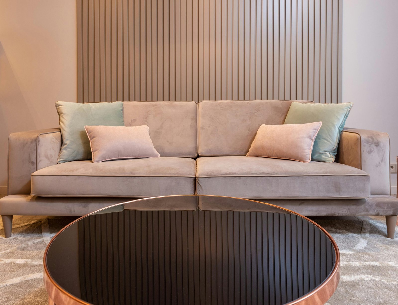
4. Neutrals for Balance and Versatility
Neutral colors, such as white, beige, gray, and taupe, are timeless choices that work well in any space. They can be used as the primary color or as accents to complement brighter hues. Neutrals offer a calm, sophisticated backdrop that can make other colors pop, or create a minimalist and serene environment on their own.
Best Uses:
- Living Rooms and Entryways: Neutral walls can make a space feel open and inviting, while providing the perfect canvas for colorful artwork and furniture.
- Dining Rooms and Kitchens: Beige or light gray tones can create a subtle and elegant backdrop, making it easy to mix with bolder colors or natural textures.
Tip: Use neutrals in high-traffic areas to create a timeless, versatile space that’s easy to decorate with other colors and accessories.
5. Adding Accents with Bold Colors for Personality
Bold colors can make a statement and bring personality to your home, but it’s important to use them sparingly to avoid overwhelming a room. Incorporating accents like throw pillows, rugs, or artwork in rich, vibrant colors can infuse your space with character and energy without taking over the entire room. Think of using bold colors to highlight specific features or create focal points in your design.
Best Uses:
- Accent Walls: A deep teal or mustard yellow accent wall can add depth and vibrancy without overwhelming the room.
- Accessories: Incorporate bold colors through furniture cushions, artwork, or curtains to add pops of personality to a neutral room.
Tip: Focus on one or two bold colors to prevent visual chaos and maintain a harmonious look.
6. The Power of Light and Dark Colors
The amount of natural light a room receives can also influence how colors appear. Light colors tend to reflect light, making a room feel brighter and more spacious, while dark colors absorb light, creating a cozy, intimate atmosphere. Consider both the light levels in your room and the mood you want to set when choosing between light and dark shades.
Best Uses:
- Small Rooms: Light colors like soft whites and pastels can make small spaces feel larger and more open.
- Large Rooms: Darker colors like navy, charcoal, or deep brown can help make large, open spaces feel more inviting and comfortable.
Tip: Use dark colors on accent walls or in smaller doses to avoid making a room feel too closed in, especially if it lacks natural light.
7. Layering Colors for Depth and Texture
To create a visually rich and dynamic space, consider layering different colors and textures throughout the room. Combining varying shades of the same color, or introducing subtle patterns in your furnishings, can add depth and interest. Mixing and matching colors across furniture, walls, and accessories helps prevent a flat, monotonous look and enhances the overall aesthetic of your space.
Best Uses:
- Living Rooms: Layering different shades of blue, for example, with various textures in your furniture and throws, can create a harmonious, well-rounded look.
- Bedrooms: Experiment with different shades of green or purple through bedding, accent walls, and decorative pillows to add dimension to your bedroom.
Tip: Keep a consistent color scheme to ensure the room feels cohesive, even when layering different tones and patterns.
8. Experiment with Color Combinations
While understanding the emotional impact of individual colors is important, combining colors strategically can also play a significant role in the overall atmosphere of a room. Some color combinations are harmonious and calming, while others are bold and energizing. For example, pairing blue with white creates a serene, nautical vibe, while red and black can add drama and sophistication to a space.
Best Combinations to Try:
- Blue and White: A classic combination that evokes tranquility and freshness, perfect for bathrooms and bedrooms.
- Yellow and Gray: A modern pairing that adds warmth without being overpowering—great for living rooms or kitchens.
- Green and Earth Tones: Combining green with browns and beiges creates a natural, organic feel, ideal for creating a cozy, grounded atmosphere.
Tip: Consider the mood and purpose of the room before selecting a combination, and test colors using small samples before committing to larger areas.
Conclusion: Using Color to Transform Your Home
Color has a powerful impact on both the aesthetic and mood of your home. By understanding how different colors influence emotions and complement your existing décor, you can create a space that reflects your personal style while promoting a positive, comfortable atmosphere. Whether you prefer a calming palette of cool tones or the energizing vibe of warm colors, using color psychology is an effective way to elevate your home’s design and improve the quality of your everyday life.
With a thoughtful approach to color, you can transform your home into a space that is not only beautiful but also a place where you feel relaxed, energized, or inspired, depending on what you need most.
5 Unique FAQs
- How do I choose the right color for my bedroom?
For a restful, calming bedroom, opt for cool colors like soft blues, greens, or lavenders. These colors promote relaxation and sleep. - Can I mix warm and cool colors in the same room?
Yes, mixing warm and cool colors can create balance. Just be sure to choose a dominant color and use the other as an accent to avoid visual overload. - What are the best colors for a small room?
Light, neutral colors such as soft whites, light grays, and pale blues can make a small room feel more spacious and airy. - How can I use color to make my living room more inviting?
Opt for warm tones like soft yellows, oranges, or earthy browns to create a cozy, welcoming atmosphere. Add pops of color through cushions or artwork. - Do I need to use only one color palette throughout my home?
While it’s not necessary to use the same palette throughout your entire home, maintaining a consistent color theme from room to room can help create a harmonious flow.